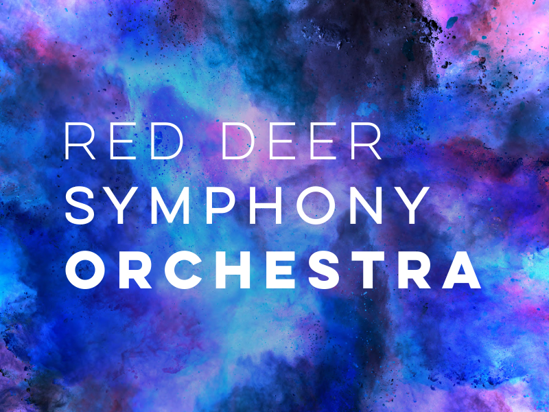


The logo is a visual representation of sound - going from quiet to loud. It was created to enhance the imagery around it, not distract from it.

With the campaign we invite people to “let go.” Let go of the stigmas around classical music and invite the audience to see what the symphony is really all about.

Colour splashes are a big part of the brand elements, they are invigorating and lively. The splashes represent the strength and power in music and how it can be moving.

Keeping with the splash style, instruments are incorporated within the colour splashes as a way to directly tie in symphonic music to the imagery.

Incorporating a famous composer's image within the same splash style to promote an upcoming concert.

Another example of incorporating the splash style throughout various marketing materials.